Zackary Krasnansky of JZK Studios contacted me via Instagram a while back. He initially reached out looking for a pinup artist who could emulate the Gil Elvgren style. As things often happen, the timing wasn’t right, but thankfully another project came up and Zack reached out again for his new movie “Nemesis”.
Once of the coolest things about working on movie posters, especially for cinephiles, is the opportunity to look behind the scenes and see what the director is thinking. Zack emailed me a script that he wanted me to read before we met up virtually. I totally ignored it as I wanted to hear about the movie from him first. We had a great talk about his movie and his intentions and, most importantly, I could hear and see his passion for the project. That is one of the key factors for me getting involved with any project. I can get hyped for just about anything, but I get even more hyped when I get to see the passion in others!
I immediately asked for spoilers of course. He asked me if I had read the script and I said no, but assured him that that was ok, at least for me, as my job ultimately requires me to simply know what is going to happen i the film so getting right to it is what matters the most. He gave me the pitch and I loved the idea and we agreed to start on some preliminary sketches. I didn’t have access to any footage from the film yet, but based on our conversation and finally reading the script I got to work!
Here are some of the initial ideas I came up with:
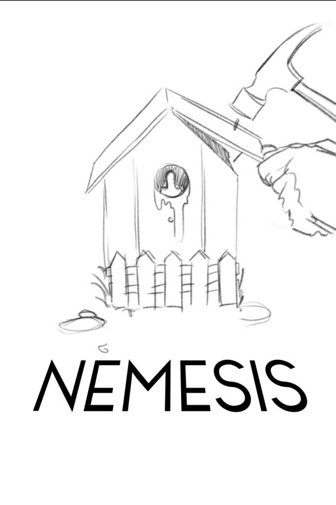
Diorama Inspired 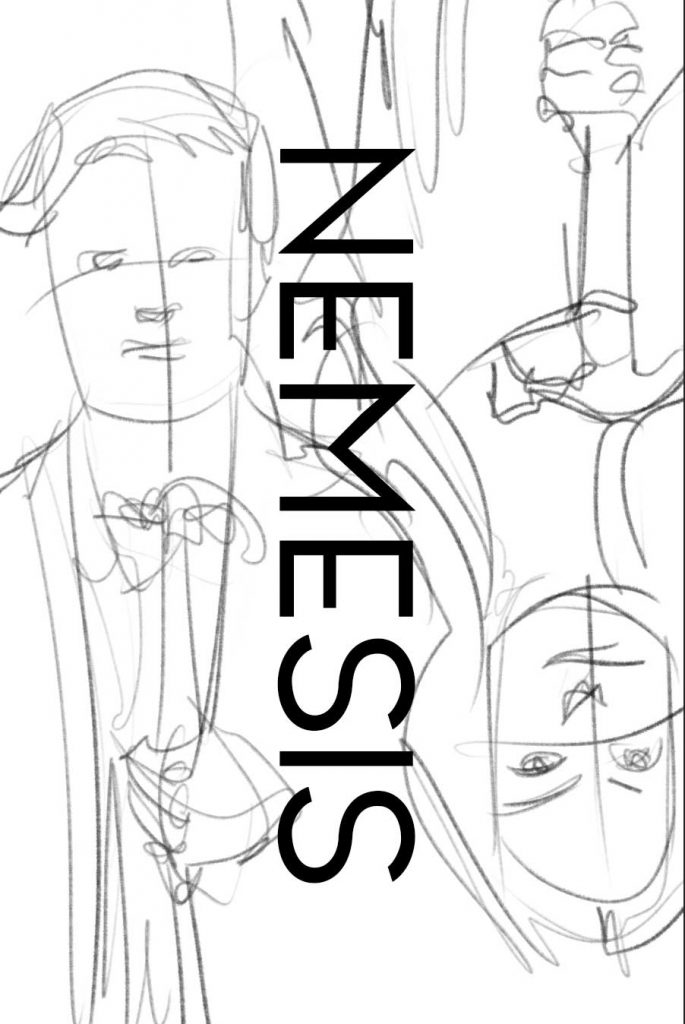
Playing Card Inspired 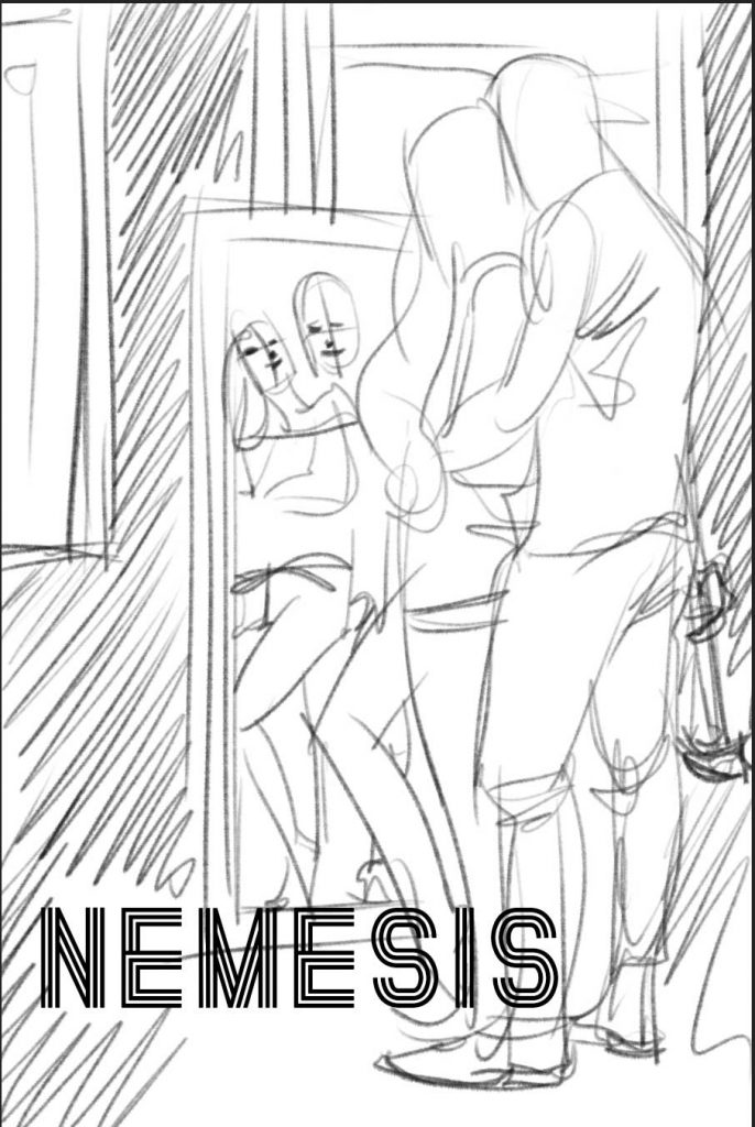
Mirror Couple 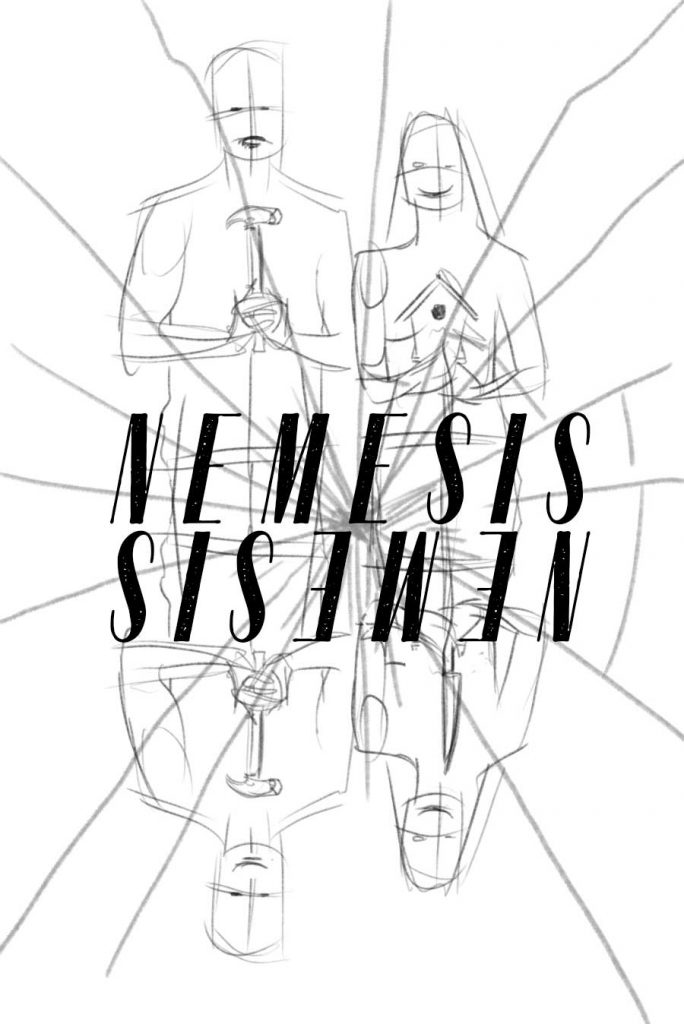
Narrative Allusion 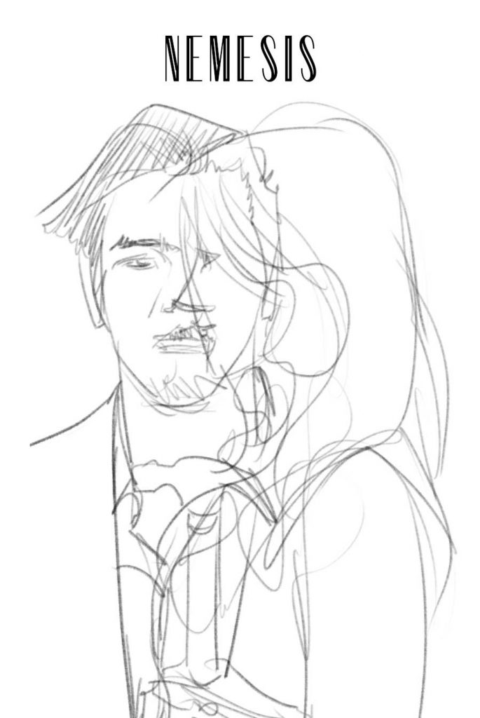
True Detective Inspired
Preliminary sketches are one my favorite things to do. I have a lot of nonsense floating around in my head and this is my chance to explore and get it all out. Good, bad, it doesn’t matter, it all hopefully helps me and my client get to where we want to me. In this case Zack is one of those amazing clients that wants to see what I can come up with first, which is wonderful since I don’t have to start by being constrained. Just a note that it is perfectly okay for a client to have a specific idea too. coming to the table with a sketch has plenty of advantages. The key to creating a poster or any collaborative art for that matter, is keeping the lines of communication open and being honest in your feedback!
Zack came with some feedback and wanted to dive deeper into the Narrative Allusion sketch. I myself, liked that idea and the diorama idea the most so I was excited to get into it. Zack was also kind enough to send me a library of references from the film and it looked like we may have already have been on the same page which was also very cool. Still Keeping things rough I made some modifications and sent him this:
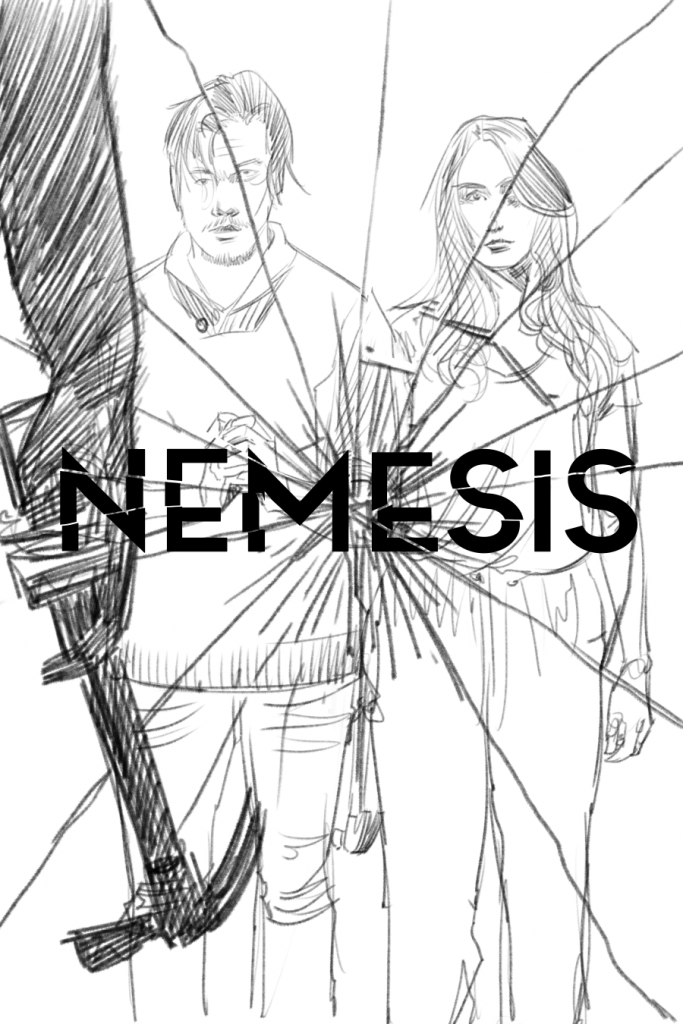
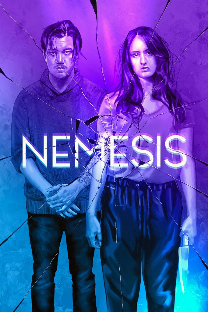
Zack was into it, which was great. As many of your commercial artists out there have experienced. It does occasionally take some time to get to a sketch that everyone is happy with. In my opinion, this is really the hardest part. Once you get this down it really is a matter of getting it done. One of the nice things about this poster is that it was always going to be monochromatic in my mind. One color means ones thing to me, I don’t have to paint flesh tones!! Grayscale should be all I need to make this work. So the next step is to draw something pretty and add some value to it!
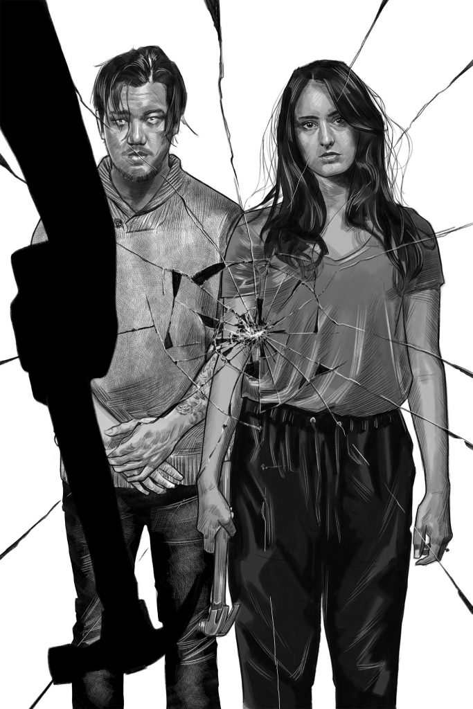
The final step is really a lot of nitpicking for me. Typography matters and it matters a lot. Getting the right look and feel for the movie and trying to express what the movie is trying to convey should be a consideration when choosing or creating type for a poster. In this case I got a sci-fi/thriller/film noir sort of vibe with it and chose to head in that direction with the type. Zack did not ask me to do this by the way, but it is sort of the way my mind works. Imagery and Type will forever be intertwined so I end up doing both. The client get a no type treatment version at the end of the project, just in case.
Really close to done, but we are having thoughts about the hammer. Is it needed? What if she is holding something else. Does the cracked glass/mirror tell enough of the story? This is that moment where I have to be quiet and listen to the voice in my head. Trust that the nagging feeling in my stomach! I think I like the hammer, but I ask some design friends and the client. They all love it, but think it can go. Especially if we do a little redraw. Let’s put a knife in her left hand and take away the hammer!
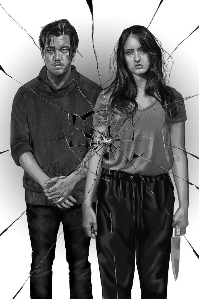
Feeling pretty good about it. I know get to doing my color overlay and what I consider purely design work to wrap this up. I toss and turn for a while. I stress about the color and the type and I nitpick it to death. Not the technical perfection, because there are a lot of flaws in my work. I struggle the most about the idea. Is the idea working? I think it is and thankfully the client does too. Finally, we reach the end of the Nemesis poster journey and I hope it is well received and does justice to Zack’s final cut of the movie!
0 Comments